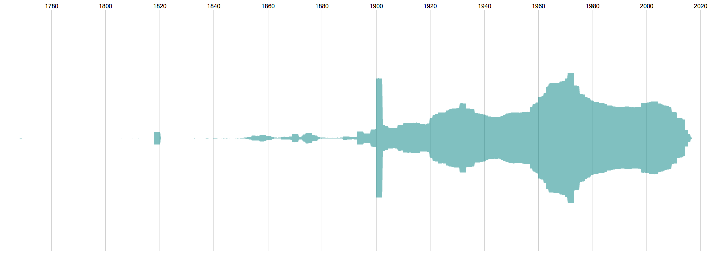
The above screenshot is from a timeline tool I developed for visually analysing large cultural collections. I imported the MoMA dataset and visualised the object records along their production dates. We can see the timeframe the collection spans, with earliest pieces from the late 1700s and – obviously – a focus on twentieth century and contemporary items.

The block shape around 1820 and the rectangular spike at 1900 represent large numbers of items that have the same, or very similar, production dates. Such anomalies can stand for series of items in the collection, they can be traces of curatorial decisions in cataloguing, they could be mistakes in dating, etc.
I inspected a few records in the 1900 spike and encountered a few photographs, which gave me the idea that the spike could represent a larger series of photographs – this would explain the high production output in a short timeframe. The tool allows me to colour records according to a field value, so I gave it a try and coloured all photographs in green:

It appears that photographs only make up a small part of the 1900 spike. The clusters between 1860 and 1880 on the other hand appear indeed to be all photographs.
The vertical arrangement of the records in the visualisation is in order of accession. In the above screenshot, we can look at the coherent patches of green to see which photographs have been accessioned after each other (as a series) and which have been catalogued individually.

The 1820 block is more homogenous. All records are associated with a certain Thomas Bewick, who I only just learned was an English engraver. He doesn’t seem to appear in MoMA’s online catalogue though.
I added a second diagram which arranges the records of the collection by acquisition date (the bottom diagram in the following screenshot). We now get an idea of MoMA’s collecting history, with spikes representing years of high activity – possibly in relation to major exhibitions. Thomas Bewick is highlighted in both diagrams in orange. All works have been acquired at the same time in the mid 1960s.

If we zoom in on the cluster in the bottom diagram, we see how the records have been accessioned after each other. But what’s this? A single non-Bewick record sits right in between all the Thomas Bewick items!

This lonely dot represents a book ascribed to Francis Bacon and illustrated by Thomas Bewick – mystery solved! Francis Bacon is present in the MoMA online collection as well, however I can’t seem to find that illustrated book. This might have something to do with the “Cur. Approv.” field, which stands for “Curator Approval”. It’s quite possible that this field controls which records are exposed via the online collection, while the GitHub dataset contains the complete record.

That’s all for now. Back to thesis writing…
Oh and one request MoMA: can you please include the URLs to the images, at least in thumbnail size. That would be terrific as I could then replace all these placeholder dots and make your collection look as lovely as the Tate’s.

Or the Geffrye’s:

Thanks!