In 2009, Walter Alvarez was looking for a way to communicate the enormous time frames that make up the history of the universe and conceived the idea of ChronoZoom, which was released as an early prototype in 2010. Since then, the visualisation evolved quite a bit and by now contains a rich collection of data. What I only found out recently, is that all of this data is also accessible separate from the visualisation through a dedicated API. Recently, the makers of ChronoZoom launched a contest in collaboration with the platform Visualizing.org in order to, I’d guess, promote the use of this API and at the same time tackle some of the problems they encountered. One of these problems is the fact that it is not easy to get an overview of that data with the current version of the ChronoZoom visualisation. This is mainly because the focus of that visualisation is to communicate the relation between events that can span any timeframe from the millions of years that make up the history of the universe, to a few decades that make up the industrial revolution. When zooming into ‘Life’, for example, one can hardly make out the timelines it contains, yet alone the history of humanity, which is so tiny that it doesn’t even appear at this scale.

For the contest I therefore redesigned the ChronoZoom visualisation with a focus on being able to explore the content of the dataset as a whole, in addition to focussing on individual timelines. Have a look at the result here. The visualisation is based on the actual structure of the dataset, which is organised as a tree. My visual Time Tree not only shows the hierarchical position of the data in the tree, but also its location and extension in time. At the root of the tree is the Cosmos timeline, which contains three child timelines. Those again have children, but for better clarity, they initially remain hidden.

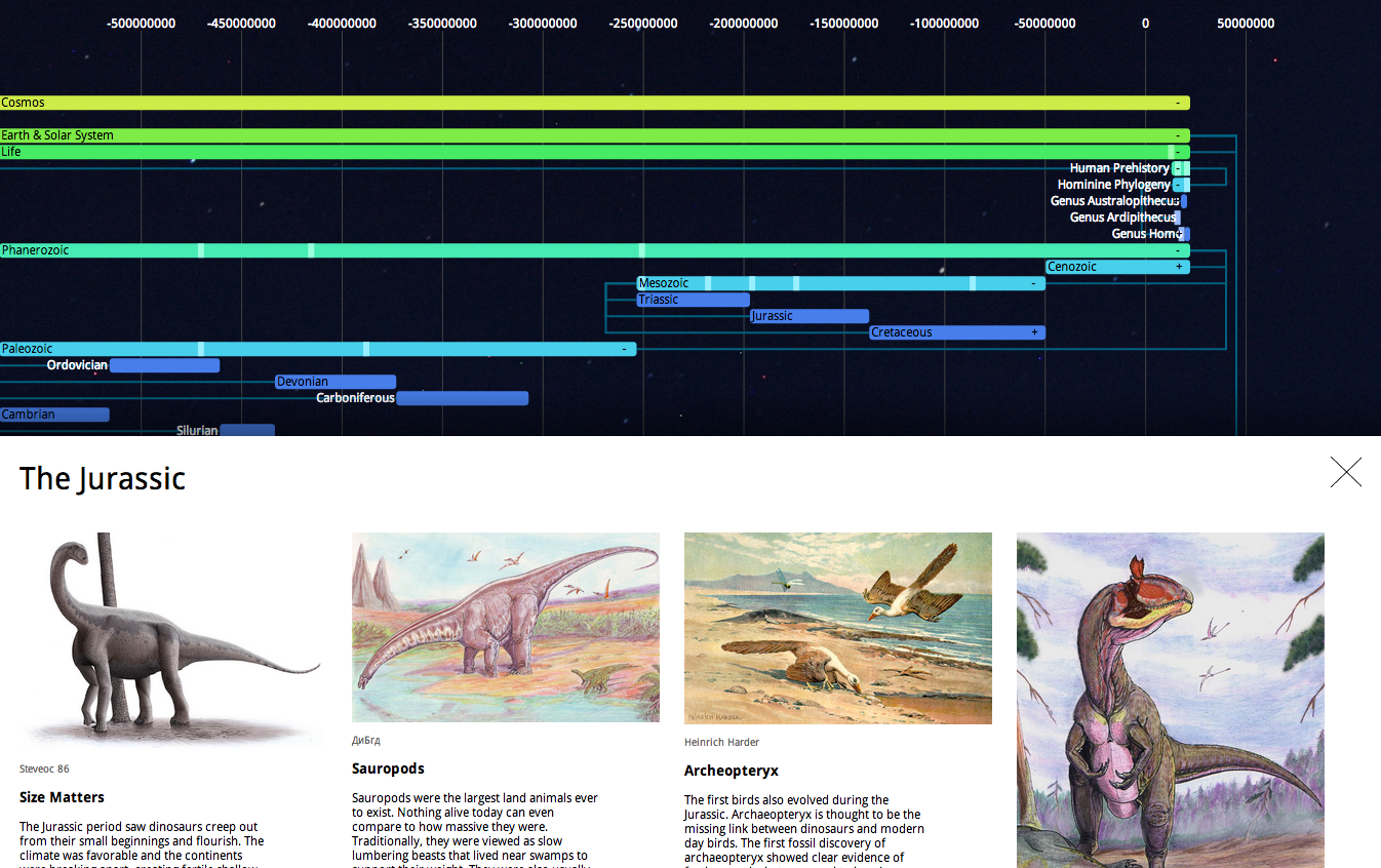
Most timelines also contain exhibits. Exhibits are curated collections of texts, images and videos. In the original visualisation, these are represented as bubbles. By clicking on them the user can zoom into these bubbles and examine their content. I found that, when zooming in, one loses the context of these exhibits as it is no longer evident, where ‘in time’ they are positioned. Therefore, I implemented a separate viewer, which can be accessed by clicking on the exhibits, represented as highlighted rectangles on the timeline.

The exhibit stays highlighted, so it remains visible when navigating further through the timeline. Clicking on a timeline focusses in on it and reveals its child timelines. The focussing works similar to the original ChronoZoom visualisation by zooming in on the selected timeline. However, the timelines are only scaled horizontally. Retaining the same height makes sure the text stays readable at any zoom level. One can also pan the visualisation by dragging it and zoom in and out using the mouse wheel. It is also possible to zoom out by clicking on a timeline higher up in the hierarchy. Below is the visualisation zoomed in on Earth & Solar System with the first timeline Life expanded and again with all timelines within Earth & Solar System expanded


In the same view in the original ChronoZoom visualisation it is very difficult to make out the names of shorter timelines, or even timelines just two level below the selected one. In the TimeTree, all labels remain readable due to the consistent vertical size of all the timelines. Moreover, you can collapse timelines you are not interested in by clicking on ‘-‘, while simultaneously expanding others.

A useful side effect of this representation is that it is very easy to compare timelines, something which is difficult in the original ChronoZoom. In the view below one can see which types of humans co-existed and for how long. By keeping timelines collapsed, it is even possible to compare events across timelines in ‘busier’ periods, such as the more recent human history.


Through the exhibit viewer, it is then possible to examine the content of timelines, without losing the overview.

What I still would like to implement are more sophisticated ways of interacting with the timelines. For example, using a yardstick to measure the distance or overlaps between timelines. Or being able to ‘pin’ selected timelines, in order to keep them visible and/or compare them with other events across larger timeframes. There are also some technical aspects still unsolved. Currently, the visualisation starts flickering when zooming in very far, which probably has to do with limitations in JavaScript and HTML when dealing with very small numbers. Feel free to download the source code if you’d like to experiment with it, or continue reading here to find out more about the technical side of all this.